My role:
Design System Lead, Systems Architecture, Visual Design
Project:
Company-Wide Design System for Multiple Internal Systems
Goal:
Create a unified design system that enables developers to quickly access reusable components and build user requirements without inconsistency or duplication
A unified design system that streamlined development, reduced inconsistencies, and enabled faster, more consistent product delivery.
As our ERP and mobile systems grew, our team noticed we were solving the same design problems over and over. Developers were building interfaces from scratch for each new feature request, even though most shared common UI patterns.
Inconsistent UI across platforms
Developers recreating components manually
Slow design-to-dev handoff
Repetitive design work draining team time
Our Goal
To reduce this friction, we aimed to create a unified design system that could:
Serve as a single source of truth for designers and developers
Speed up development by offering ready-to-use components
Ensure consistent experiences across all products
Reduce duplicated effort and streamline handoff
- Directing the Audit: I directed the team in conducting a thorough audit across our various legacy systems to systematically extract, harmonize, and rationalize common UI patterns.
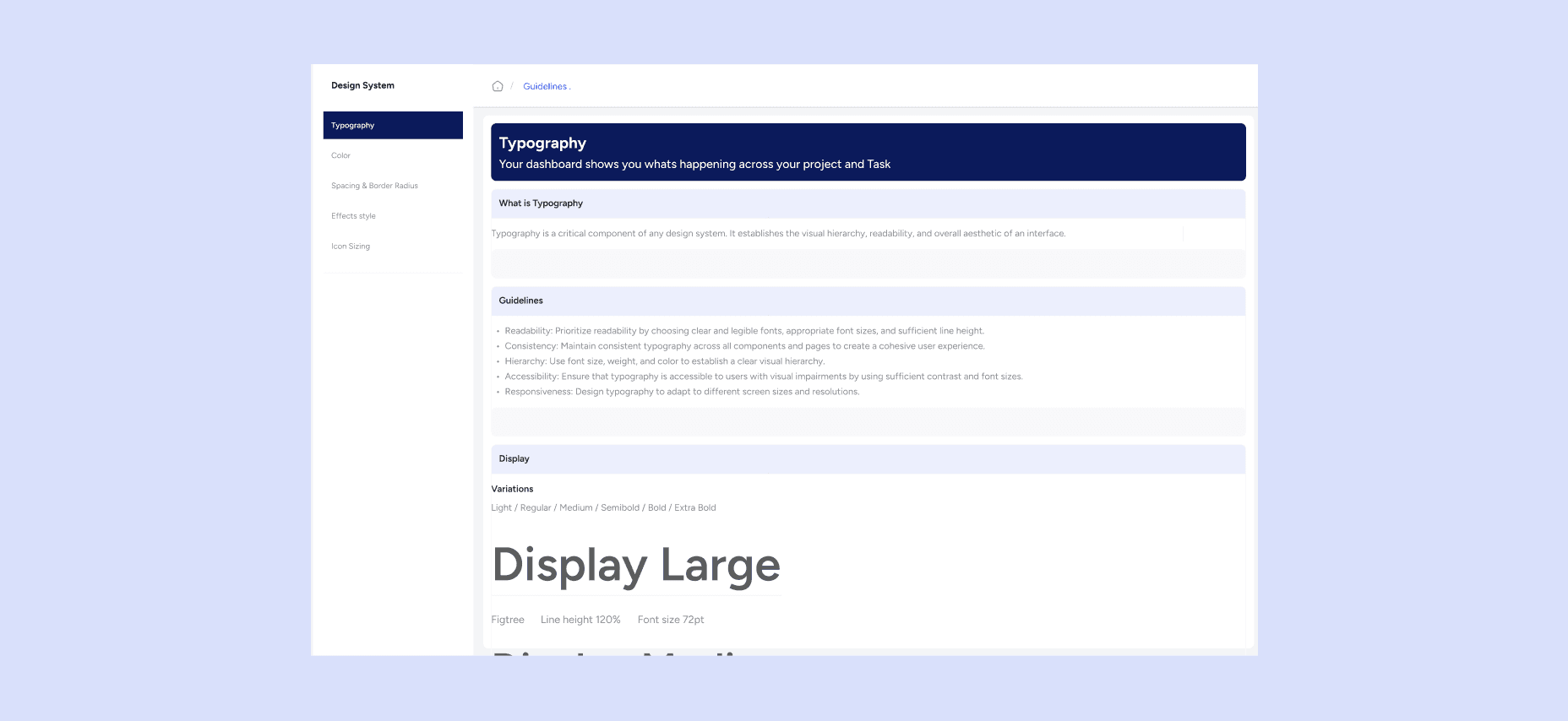
- Defining Foundational Tokens: I led the definition of the core design tokens, establishing a single source of truth for typography, color palettes, grid, and spacing rules.
- Building the Component Library: I oversaw the meticulous construction of the reusable component library within Figma, ensuring all elements included clear variants, states, and accessibility considerations.
- Authoring Centralized Documentation: I authored and governed the comprehensive documentation, establishing robust usage rules, component specifications, and critical best practices for the entire team.
- Leading Technical Collaboration: I drove the critical collaboration with front-end engineering to ensure seamless technical implementation and the successful integration of the coded components.
- Facilitating Adoption: I led the cross-functional onboarding and training sessions to facilitate team-wide adoption of the new unified system standard.
The system was architected around scalability, developer handoff, and ease of use for every product team. It was intentionally divided into four core pillars to serve as a complete source of truth:
Foundations
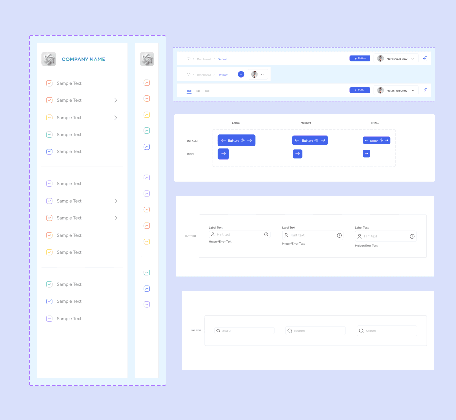
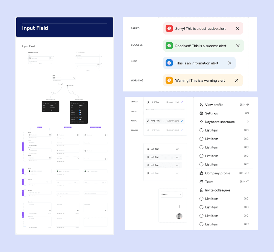
The elemental building blocks, including the complete color palettes, defined typography scales, consistent spacing units, and comprehensive iconography library.
Components:
The primary reusable interface elements, such as Buttons, Inputs, complex Tables, Navigations bars, and Modals, each built with clear variants and states.
Result & Impact
The Change: Implemented a persistent, context-aware action bar (or "Quick Actions" in the main navigation).
Before: Actions like "New Sale," "Receive Stock," or "Client Lookup" were nested deep within specific modules.
After: Everyday actions were made readily available on the main navigation bar, accessible from any module screen. This dramatically reduced search time and cognitive load.
35%
Improved onboarding process
25%
Increase in user retention
84%
Increase in time spent on website
Patterns
Solutions for common user flows, encompassing standardized Form layouts, advanced Filters, rigorous Error Handling, and defined success/empty states.
Documentation
The essential guidance layer, featuring clear usage guidelines, visual do's and don'ts, accessibility notes, and developer code references to ensure adoption and consistency.
Result & Impact
The implementation of the Design System delivered immediate, quantifiable results across the organization:
Elevated Consistency: Established a unified, consistent visual language across 5+ major product platforms, eliminating UI fragmentation.
Accelerated Delivery: Enabled faster feature delivery across all ERP products by providing ready-to-use, coded components.
Reduced Friction & Rework: Streamlined the design-to-development handoff, with developers accessing the system directly for implementation, significantly reducing the need for detailed mockup review.
Fostered Reusable Thinking: Successfully aligned internal teams (Design, Engineering, Product) on a mindset focused on reusable, scalable system thinking rather than one-off solutions.